Redefining a 40-Year Wellness Brand for a Data-Driven Future


When a 40-year-old wellness company rebuilt its flagship risk assessment platform around a powerful new data engine, its brand and content still told an old story. My work was to bridge the gap between legacy credibility and a modern, technology-forward narrative.
Client: Wellsource, a B2B population health and wellness provider.
Type of work: Brand audit, messaging framework, visual brand refresh, content audit, and 12-month content strategy
Core Challenge: existing brand emphasized expertise and compliance, but underplayed the data and technology now central to the product.

Erin has such focus and determination, consistently delivering work that exceeds expectations. Her ability to simplify complex and abstract ideas and make them accessible is invaluable, whether she’s speaking with clients, developers, C-suite executives, or customer service reps.
- James Bennett, VP Of Operations at Wellsource
The Challenge
Wellsource had a strong reputation for clinically sound, compliant health risk assessments, backed by decades of experience and long-tenured customers. But after a significant digital transformation, their brand lagged behind the sophistication of their platform and the role of data in driving better health outcomes. Messaging focused heavily on history, regulation, and personal stories, leaving the technology and data engine almost invisible.
The solution had to be scalable and highly templatized, as any modernization efforts would be deployed across 30+ web pages, 50+ landing pages, 40+ pieces of marketing collateral.


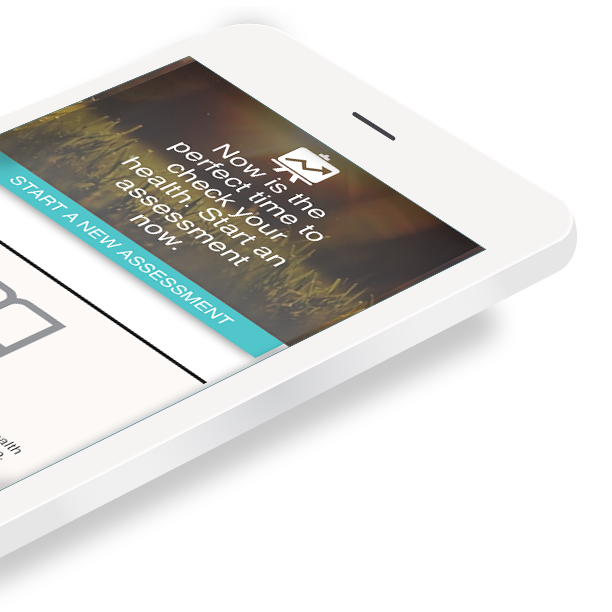
Example of previous branding elements
Voice of the Client: Interviews and Personas
Partnering with the client success team, I led a qualitative research effort, interviewing 12 clients across multiple industries and use cases. We intentionally included champions, budget holders, and common detractors, as well as both ideal and no-longer-ideal customers. From these conversations, patterns emerged that became two primary marketing personas and a clearer picture of how buyers move from pre‑sale through retention and loyalty.
From features to message pillars
Using the persona insights, I mapped product features to benefits and buyer motivations, then built a messaging framework that aligned message pillars with client outcomes and company values. The work shifted the story from abstract “expertise and compliance” to concrete value anchored in data-powered insights, technology-backed workflows, and their impact on population health.

Website before and after rebrand
-

Keep it Human-Centered
Continue to represent people of all walks of life, engaging in healthy everyday behaviors.
-

Incorporate more visual cues of the products and technology
Showcase the product in more modern, simplified device mockups.
-

Represent the value of data
What should we know about the services you provide? Better descriptions result in more sales.
“The Swooshies”
The colorful branded band of lines, dubbed “swooshies” by the team, represents the prevalence of health data, and the capability of the product to reveal what is otherwise hidden about a person’s health and lifestyle. It is layered, complex, and beautiful.
Incorporating “swooshies” into imagery was also an effective way to add branded visual interest to otherwise stock photography.


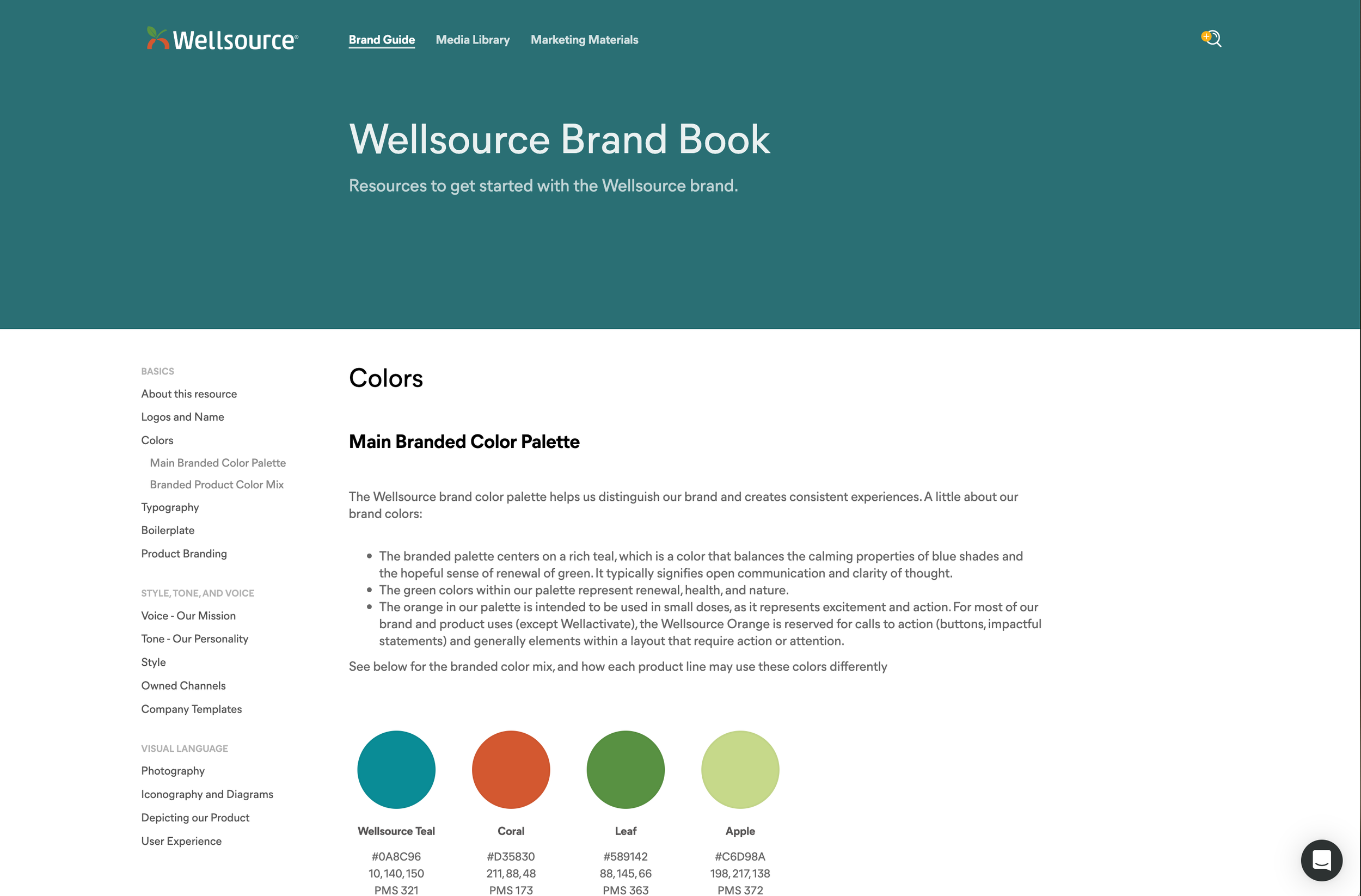
A Documented Content Strategy and Brand Guide
More than building a brand identity, this project meant building a design system that could be flexible but consistent across multiple stakeholder departments. The brand guidelines developed included everything from tone and style, to channel best practices and how to represent screenshots of the product.
The brand guidelines and marketing materials library became a significant resource across the company, putting the ability to build branded, consistent documents into the hands of developers, client success, sales, and the executive team.